
When was the last time you really looked at your menu — not as the owner, but as a customer?
Because in Malaysia’s fast-moving F&B industry, customers make decisions quickly — and a poorly designed menu can cause hesitation, confusion, or even second thoughts about ordering.
A confusing layout, too many choices, or hard-to-read fonts can quietly slow down service, frustrate diners, and cause your best dishes to be overlooked. Over time, these small friction points add up — lowering your average order value, reducing table turnover, and ultimately impacting your profitability.
Yet many cafés, restaurants, and bars don’t realise their menu design is quietly working against them until sales or customer satisfaction starts to slip.
In this article, we’ll break down the most common menu design mistakes that could be turning customers away — and show you how simple, strategic improvements can help you speed up orders, boost revenue, and create a better dining experience.
What Are The Common Menu Mistakes That Turn Customers Away?
Having Too Many Menu Items
It might seem smart to offer a wide range of options, but a menu with 50 or 60 items can overwhelm customers instead of exciting them. When diners are faced with too many similar choices, it causes decision paralysis — leading to slower orders, lower spending, and frustration during peak hours.
Research from Caltech shows that while more options seem attractive at first, the brain struggles to evaluate too many at once. After around 8 to 15 options, the decision-making process becomes harder and less rewarding, resulting in delayed or poorer choices.
For example, if you’re running a café and offering 30 different variations of coffee, customers might end up taking too long to decide — slowing down your table turnover and reducing the number of orders you can serve during busy periods.
Offering variety is important, but overwhelming customers with too many similar options can negatively affect your sales and the flow of your operations.
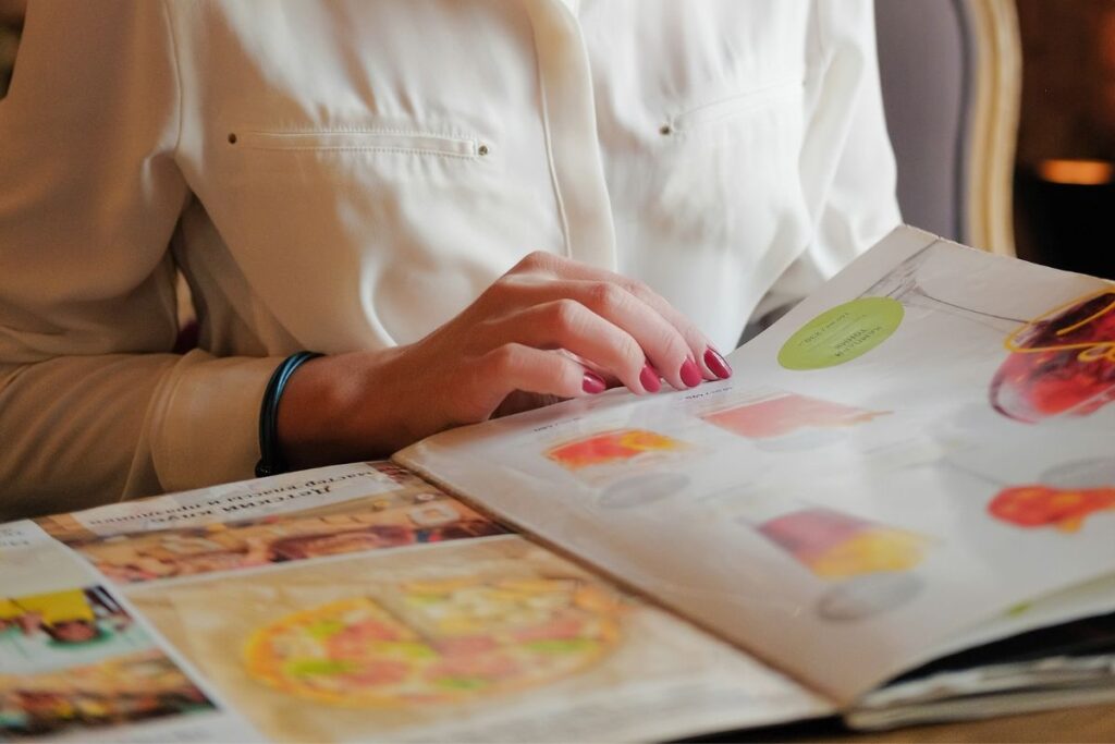
Designing Menus To Be Difficult to Read
Small fonts, elaborate cursive typography, poor contrast, and dim lighting can make a menu difficult to read — and if customers struggle just to see what’s available, they’re much less likely to order confidently or spend more.
This is a common problem, especially in trendy cafés and bars where the ambience is great, but menus force customers to squint or pull out their phone torchlights just to place an order. It creates frustration before the meal even starts — slowing down service, lowering satisfaction, and pushing diners to rush their choices or skip add-ons like drinks, sides, or desserts.
Physical menus also suffer wear and tear quickly, especially in high-volume F&B businesses. Torn pages, sticky stains, faded printing, or crumpled covers not only make menus hard to read, but also create a negative impression on your F&B business’ hygiene.
For example, a customer flipping through a ripped, greasy menu at a café is more likely to question the overall cleanliness and quality of the business — even if the food is great.
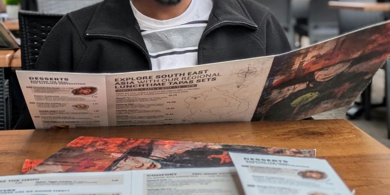
Having Poor Menu Layout with No Clear Flow
A confusing menu layout makes it harder for customers to decide quickly. When dishes are scattered randomly without clear sections, diners waste time hunting for what they want — leading to slower orders, lower spending, and missed opportunities to upsell sides, drinks, or desserts.
For example, if you’re running a restaurant and your starters, mains, and desserts are scattered across different pages with no clear structure, customers are more likely to miss key dishes or get frustrated while ordering — especially during busy lunch or dinner hours.
Confused diners also tend to flag down waiters to ask questions, which takes up valuable staff time that could be better spent preparing food or turning over tables faster.
How to Improve Your Menu Design and Boost Sales
Keep Menus Focused and Categorised Clearly
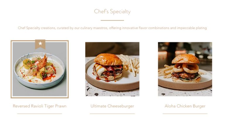
Photo Credit: Flint Café & Roastery Official Website
When it comes to menu design, less is more — and structure matters.
Limiting each section to around 7–10 items helps avoid overwhelming customers and speeds up ordering. Organising your menu logically — from starters to mains, sides, drinks, and desserts — creates a natural flow that makes choosing easier and more satisfying.
One great example of this approach is Flint Café & Roastery.
Instead of cramming everything into a few long lists, they break their menu down into clear, focused sections like “All-Day Brunch,” “Mains,” “Chef’s Speciality,” “Heritage by Balut – Nasi Lemak Series,” “Local Favourite Series,” “Snacks,” and “Desserts.”
Each section is tightly curated, featuring no more than 10 items — some even just five — which keeps the selection manageable and easy for customers to browse.
What makes Flint’s menu even more effective is how each section comes with a short, enticing one-liner description that sets clear expectations. For example, “Heritage by Balut – Nasi Lemak Series” highlights authentic, traditional Malaysian flavours, while “Chef’s Speciality” introduces innovative dishes curated by their culinary team.
By spreading out their mains across different themed sections — rather than dumping everything into one overwhelming list — Flint Café & Roastery helps customers find what they want faster, without decision fatigue.
Ultimately, this kind of focused menu structure makes the entire ordering experience feel easier, faster, and more satisfying — giving customers more confidence in their choices and helping the business drive higher average spending per head.
Use Strategic Labels to Boost Underperforming Dishes
Sometimes a dish can taste amazing — but if it doesn’t stand out on your menu, it might quietly underperform.
Often, customers hesitate simply because they’re unsure what’s popular, what’s recommended, or what’s truly worth trying. That’s where smart labelling makes a real difference.
Take Yummy Nasi Lemak House Johor Bahru, for instance.
Their Ayam Berempah — a rich, aromatic fried chicken dish — wasn’t getting the attention it deserved. Rather than changing the recipe or offering discounts, the team simply highlighted it as a “Bestseller” on the menu — and almost immediately, orders increased noticeably.
By labelling it clearly, they triggered curiosity, created a subtle sense of FOMO (“fear of missing out”), and gave customers an easy decision.
Customers felt more confident choosing it, and were more willing to try a dish they might have otherwise overlooked.
Strategic labelling taps into powerful behavioural triggers like trust, social proof, and decision ease. By spotlighting high-quality but slower-moving items this way, F&B businesses can boost underperforming dishes naturally — without costly promos, steep discounts, or constant menu changes.
Done right, it’s a simple but powerful way to maximise your existing menu and grow sales more sustainably.
Optimise for Mobile-Friendly QR Menus
In Malaysia’s competitive F&B industry, QR ordering has become a must-have for cafés, restaurants, and bars.
Customers today expect the convenience of browsing, ordering, and paying — all from their smartphones.
However, just offering a QR code isn’t enough.
Many F&B businesses make the mistake of simply linking to a static PDF uploaded on Google Drive or Canva. While it might seem like a quick fix, these files often load slowly, are difficult to navigate on mobile screens, and offer no interactive features — leading to a frustrating customer experience.
Imagine being hungry, sitting down, scanning a QR code – only to wait for a slow-loading file, pinch and zoom to read tiny fonts, and scroll endlessly to find what you want.
By the time customers are ready to order, they’re already frustrated which can cause slower service, rushed decisions, and lower average spend.
That’s why it’s important to think beyond just “having a QR code” and focus on delivering a fast, mobile-friendly ordering experience. Providing both a well-designed physical menu and a seamless digital QR menu gives diners flexibility, catering to different preferences and improving the overall dining experience.
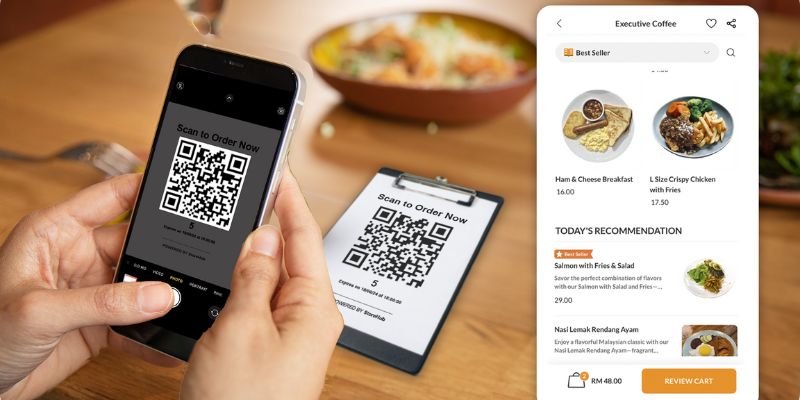
Instead of parking a static file online, invest in a proper QR ordering system that’s designed for speed and usability. Customers should be able to browse clearly organised sections, view high-quality food photos, read short, enticing descriptions, customise their orders easily, and pay — all without needing to flag down staff.
With StoreHub’s QR Order & Pay, customers don’t just view the menu — they can order, pay securely, and even claim cashback rewards right from their smartphones. Meanwhile, orders are automatically sent to the kitchen, saving valuable time, reducing human error, and freeing up staff to focus on preparing great food and delivering faster service.
Whether it’s for dine-in, takeaway, or delivery, StoreHub’s QR Order & Pay lets you update menus effortlessly across all channels — keeping everything accurate, fresh, and customer-friendly without the hassle of manual reuploads or costly reprints.
Final Thoughts
A well-designed menu does more than list your food. It also shapes how customers interact with your brand, how quickly they order, and how much they’re likely to spend.
When your menu is cluttered, hard to navigate, or poorly structured, it adds unnecessary stress to the dining experience — often leading to slower service, smaller bills, and missed upselling opportunities. And over time, these small issues can quietly affect your bottom line.
By simplifying your layout, focusing on your sections, using strategic labels, and offering an easy QR ordering experience, you make it easier for customers to order confidently and enjoy their visit, which translates to better reviews, higher revenue, and stronger customer loyalty.